

Yhonk Website redesign
Client project
6 min read

Overview
Yhonk is a social-impact startup tackling one of India’s major urban problems — excessive honking. They’ve built a first-of-its-kind patented IoT device that monitors and modifies honking behavior to promote quieter, healthier roads.
But their original website wasn’t doing justice to the product’s value. It lacked a clear narrative, had scattered messaging, and failed to emotionally connect with users. Visitors left confused, and the site didn’t convert.
Over a focused 3-week sprint, I redesigned Yhonk’s homepage from the ground up. This wasn’t just a UI refresh. It was a complete transformation of how YHonk tells its story.
My Role
UX Designer and Live website using Framer — Strategy, copy, visuals, prototyping, Microinteractions
Duration
3 weeks- April - May 25
Tools Used
Figma, Framer, Notion
The Challenge
Turning a Powerful IoT Solution into a story that connects
YHonk is an innovative startup addressing one of India’s most invisible yet harmful urban problems — excessive honking. Their patented IoT device helps monitor and regulate honking behavior to reduce noise pollution. But their existing homepage lacked clarity, structure, and emotional resonance.
It wasn’t telling a story. It wasn’t converting visitors. And it didn’t reflect the product’s powerful social impact.
That's where I came in.
The Goals - which aligned with my client and target audience
Explain the problem clearly and emotionally.
Present Yhonk’s solution in a clean, engaging, and scroll-based flow.
Add storytelling elements and interactive visuals (e.g., 3D renders, graphs).
Drive action through strong CTAs
Why It Wasn’t Working
Here’s what I found in my analysis of the original homepage:
No clear story
The homepage dived into facts without building empathy.
Missing interactivity
No scroll-based animations, live data, or real user insights.
Poor information hierarchy
Visual copy was scattered in sections making it confusing for users to understand what the website was about. Many users left without a clear grasp of Yhonk’s purpose.
No clear buttons
Key CTAs like "Click Here" didn’t work, reducing credibility.
Solutions
The Strategy: From Chaos to Calm
I structured the homepage like a narrative
journey.
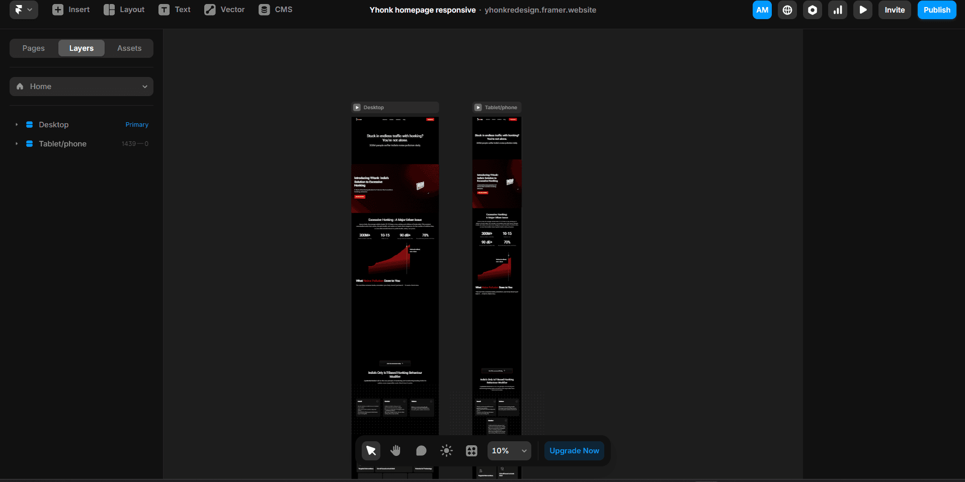
Homepage
It starts with a relatable traffic hook, followed by YHonk’s 3D product intro. Then comes the problem, supported by a live graph and health impact stats. I simplified how YHonk works into three steps: Install. Track. Reform. A feature grid explains the tech clearly, and the page ends with partner logos and a strong call to action: Join the Honk Under Control Revolution.
Copywriting with empathy
One of the biggest changes I made was rewriting the content for clarity, tone, and impact.
New: “Stuck in endless traffic with honking? You're not alone. 300M people suffer India's noise pollution daily."

Final Outcome
The client loved the fresh narrative and visuals, calling it “a homepage that finally does justice to our mission.”
I designed the homepage in Figma, then fully developed and launched it using Framer. The site is now live and is fully responsive.
Lessons & next steps
Storytelling can be the strongest design tool.
Social impact projects need emotional clarity, not just tech explanations.
Micro-interactions and scroll animations can shape the user’s emotional arc.
Explore A/B testing different headlines and CTA styles.

Let’s chat — about design, gaming or anime. I’m all ears (and bows)! 💌💭


Made by Arohi with lots of love and sparkles ✨